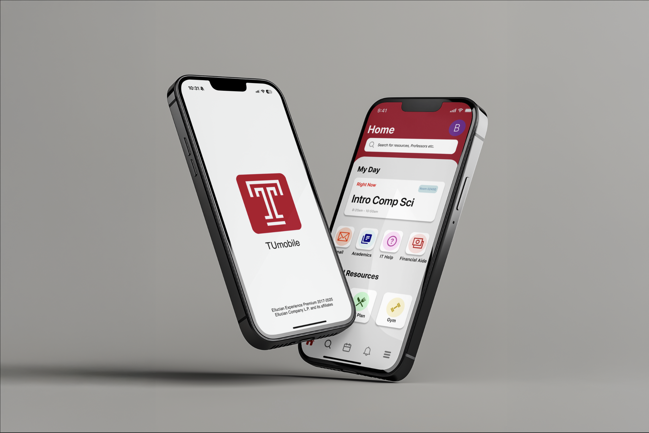
TU Mobile
This UX project reimagines the Temple University mobile app to make everyday student tasks easier and more accessible. After gathering feedback from fellow students and identifying common frustrations with navigation, I focused on simplifying how users access their classes, schedules, grades, and campus resources.
The redesign prioritizes quick access to essential tools through a clearer interface, streamlined navigation, and a more organized dashboard. By reducing the number of steps needed to find important academic information, the new experience helps students manage their daily schedules more efficiently.
Enhancing the Temple University mobile experience by creating a more intuitive and accessible way for students to manage campus resources efficiently.
PROBLEM
What problem am I trying to solve?
Many Temple students rely on mobile platforms to manage their academic life, but essential tools and information are often buried within multiple menus and separate applications. As a result, students struggle to quickly locate schedules, course materials, and campus resources. Due to this friction, many students bypass the TU mobile app entirely and instead access TU portal through a web browser to find the information they need more efficiently.
These issues made the experience annoying and more like a chore.
Even with the current login experience, it requires students to manually enter their password each time they open the app. The lack authentication (such as Face ID or fingerprint login) introduces additional friction in what should be a quick and seamless access point.
INITIAL RESEARCH
Understanding Student Behaviors & Daily Academic Needs
Why is the problem important?
51%
of users abandon apps when navigation is confusing or slower than accessing the same information through a browser.
95%
of college students rely on smartphones daily to access academic tools and communication platforms.
100%
of students report switching between multiple apps (Canvas, email, TUportal) to manage assignments and schedules.
Source: Higher Education Technology Studies / EDUCAUSE
Who am I solving for?
Target Audience
Temple University students aged 18–24 who rely on mobile apps to manage their academic schedules, assignments, communication, and campus resources.
Robin, a 20-year-old nursing student who commutes to campus and depends heavily on her phone to manage her academic schedule.
Site Audit – Key Takeaways
In order to identify usability issues and understand how students currently interact with the Temple University mobile app, I evaluated the original interface to compare strengths and weaknesses in navigation, accessibility, and overall user experience.
What worked ✅
• Provides access to multiple campus tools in one place
• Includes features like schedule, classes, notifications, and resources
• Uses recognizable Temple branding for familiarity
• Offers a variety of campus services within the app
What didn’t work ❌
• Important features are buried under multiple menus
• Navigation feels cluttered and difficult to understand
• Login process takes too long due to repeated authentication
• No clear daily overview showing schedule, classes, and tasks
•Switching to Safari to access TUportal instead of using the app because of lack of resources and cohesiveness
• Too many separate sections without clear prioritization
• Interface feels outdated compared to modern mobile apps