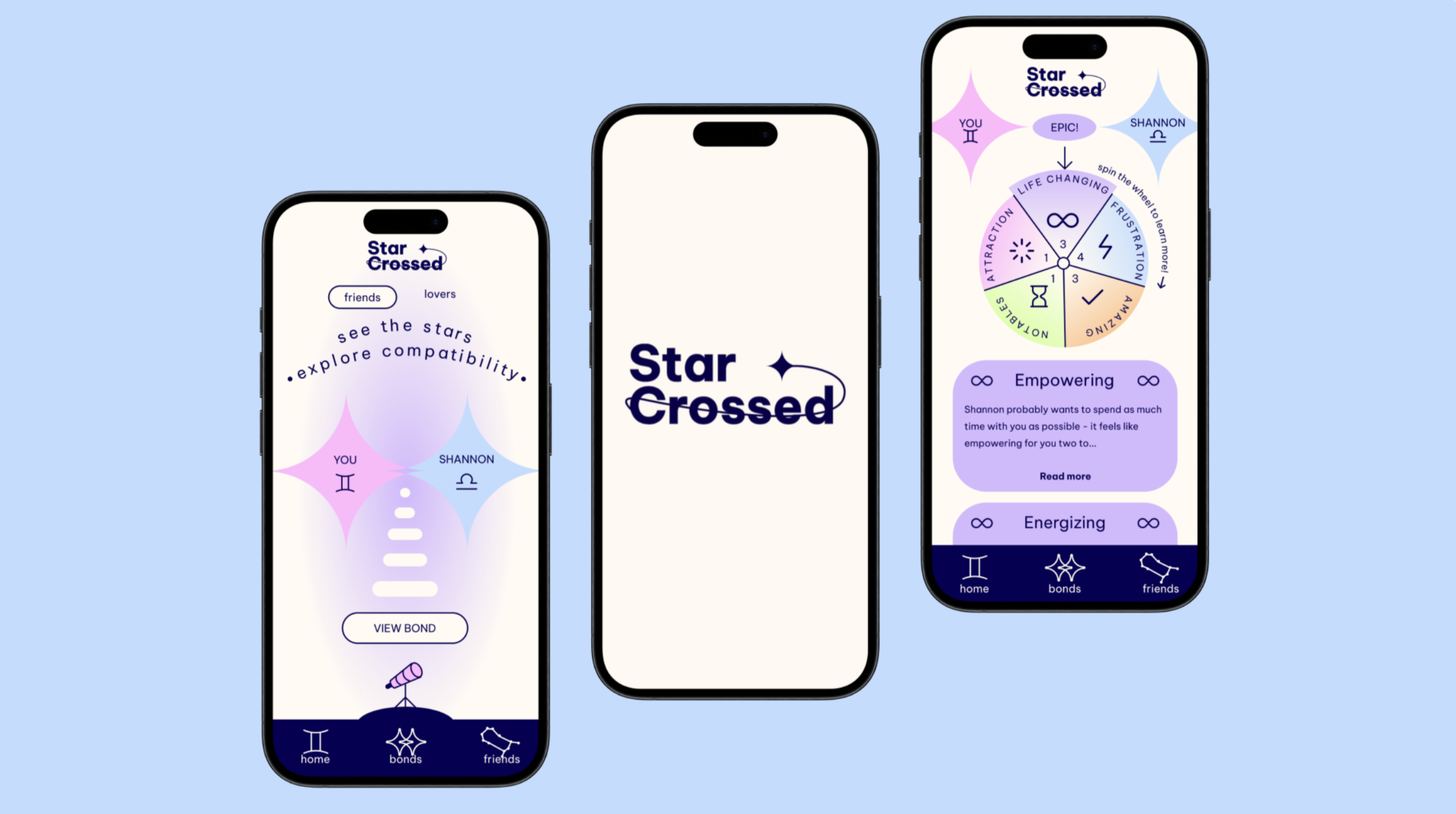
StarCrossed
StarCrossed is a rebrand of “The Pattern”, an astrology app with strong content but flat visuals, repetitive screens, and disengaging interactions. I redesigned the app to infuse personality, garner attention, and create playful, engaging micro-interactions centered around user compatibility and astrology. The result is a smoother, more delightful experience aligned with the emotional and whimsical tone of the app’s theme.
Rebranding and reimagining an astrology app through micro-interactions and a fresh visual identity
PROBLEM
What problem am I trying to solve?
The Pattern’s original design lacked visual variation from page to page, effortlessly smooth navigation, and interactive movement.
These issues made the experience feel monotonous and uninspiring.
Understanding Feelings Behind Astrology
INITIAL RESEARCH
Why is the problem important?
Users of astrology apps seek meaning, connection, and play. For them, interactions are part of the emotional experience. In fact, Gen Z makes up over 60% of online astrology users, with most seeking relationship guidance, underscoring the need for emotionally engaging design.
Source: Astroyogi Survey
Who am I solving for?
Target Audience
Young adults (18–28), interested in spirituality, self-discovery, and connection - especially those who use astrology apps to check compatibility and explore personality traits.
User Persona
Maya, a 20-year-old art student who enjoys spiritual apps with unique aesthetics and engaging, creative content. She values intuitive navigation, visual storytelling, and interactions that feel fun and personalized.
PROBLEM STATEMENT
“As a young adult interested in astrology, I find existing apps either too generic or overwhelming, and I want a more personal, engaging way to explore compatibility and daily insights based on my birth chart.”
REDESIGN GOALS
To focus my work and add intention
1
Rebrand for personality
Create a name and brand identity that feels magical, fun, and emotionally resonant.
2
Add excitement through micro-interactions
Incorporate delightful, intuitive animations to guide users and enhance engagement.
3
Improve flow and structure
Redesign the compatibility-check flow to reduce friction and increase clarity.
DESIGN PROCESS
Started off by selecting the “compatibility check” feature, one of the coolest and most defining features of the app, as the core flow to redesign. I outlined all key screens from start to result.
Task Flow
App Flow
Mapped out every interaction using the four key elements of interaction design: Trigger, Feedback, Rules, and Loops & Modes - to create interactions that respond smoothly and guide user behavior.
Renamed the app StarCrossed - a fun play on words as well as a name to describe a relationship - to reflect the compatibility theme.
Built a vibrant, playful brand using:
Colors: Pastel tones to convey whimsy and emotion
Typography: Be Vietnam Pro and Darker Grotesque for clean, friendly appeal
Iconography: Custom astrology icons to reinforce theme
Rebranding
Sketched 30+ concepts to explore layouts and visual elements - sun/moon buttons, zodiac icon nav bars, and astrology-themed micro components. Although this step took quite a bit of time, it was one of my favorites because I was able to see my ideas for the task flow come to life.
App Interface Sketches
Created grayscale wireframes of each screen in the task flow. I labeled it with trigger points and transitions to signify the way the app would run.
Wireflow
IX Flow
Brought wireframes to life with brand elements and animations. Defined how each micro-interaction would work, ensuring smoothness, purpose, and aesthetic consistency.
Interaction Sketches & Guides
Brought wireframes to life with brand elements and animations. Defined how each micro-interaction would work, ensuring smoothness, purpose, and aesthetic consistency.
How the interaction is triggered (with gesture icons, e.g., tap or swipe)
Interaction outcome (e.g., expand constellation)
Final Animation
Used Jitter (a Figma plugin) to animate each screen and micro-interaction directly from Figma frames.
🎯 Focus:
Consistency: Common elements slide in, expand, or fade for a soothing visual rhythm
Playfulness: A telescope interaction lets users “look into” the stars, which then connect two profiles via animated constellations
My favorite animations included: the telescope animation, which makes the user “look into” the telescope to “see the stars”, and the constellation “connecting” the two souls after the telescope expands.
Each animation was refined for timing, smoothness, and emotional impact. Once complete, I combined them into a final video and overlaid gesture indicators to guide viewers.
RESULTS
The redesign successfully transformed the experience:
✨ Infused the app with brand identity and charm
🔁 Smoothed navigation and reduced friction
💫 Created delightful, meaningful micro-interactions
🔮 Designed an astrology experience that feels immersive and memorable
This was my first time building a full interaction design flow from sketches to final animated prototype. It taught me the power of tiny interactions in creating an emotional connection with the user.
Here’s the final render!
TAKEAWAYS
Things that I learned
This project taught me how much movement and micro-interactions shape user experience, especially in apps tied to emotion and identity. StarCrossed helped me think beyond usability and toward emotional engagement.
Next Steps
With more time, I’d conduct user testing with astrology app users to refine gestures and timing. I would also explore full onboarding and personalization journeys, as well as experiment with prototyping a live experience with real-time compatibility results and dynamic data.