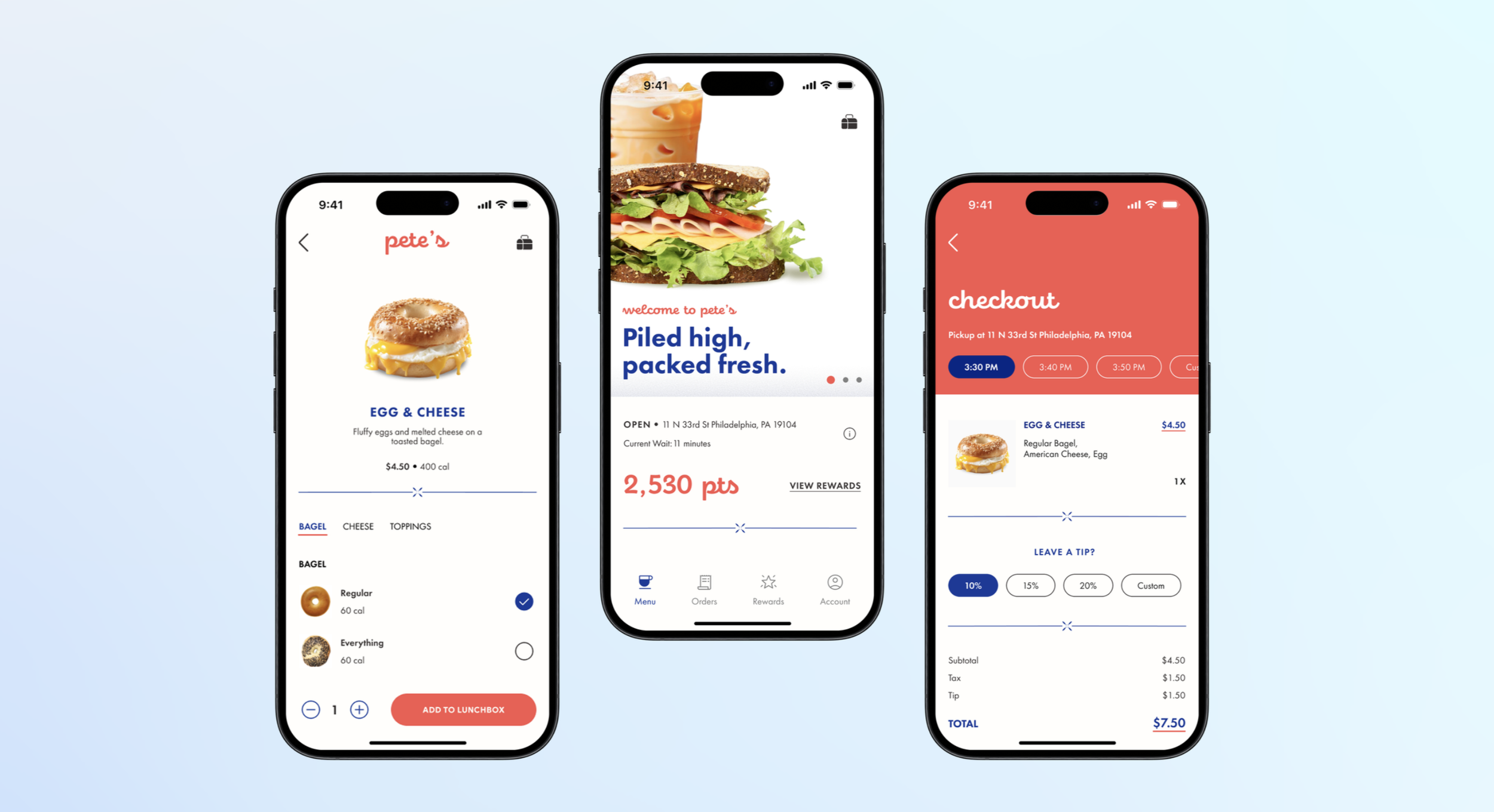
Designing a fast & friendly mobile ordering experience for a food truck that runs on regulars.
PETE’S LITTLE LUNCH BOX
AT A GLANCE
Pete's Little Lunch Box is a small, beloved food truck parked in central Philadelphia, known for a convenient breakfast, its friendly employees, and a loyal community of regulars. My team set out to design a digital ordering experience that matched the fast-paced, student-centered culture of the truck one that would reduce line buildup during peak rushes without losing the personal, familiar feel that keeps people coming back.
I led our research and kept the project organized from observation through final prototype, while also shaping the core UX flows and the visual layout of the app.
PROBLEM
ROLE & TEAM
User Research, Project Organization, UX/Interaction Design, Layout & Visual Design alongside Shannon Jaya, Ashley Nguyen, and Maayan Chashper
SKILLS
Figma
Adobe Suite
Usability Testing
UX Research
IMPACT
✅
95%
completion rate amongst primary tasks in the app across 20+ user tests.
🤳
3/10 → 8–10/10
completion rate amongst primary tasks in the app across 20+ user tests.
🥡
100
of users believed this app would make ordering from pete’s more convenient.
A predictable rush was creating an unpredictable wait.
Like many campus food vendors, Pete’s Little Lunch Box operates on a predictable but time-sensitive rush pattern. Lines can form rapidly around noon as students pass between classes, and workers often need to place orders quickly while on their break. Because the menu is small and most customers are regulars, people tend to order immediately without browsing, but bottlenecks still form during the peak window. Customers typically wait between 1–6 minutes depending on the order, and many pass the time listening to music, scrolling on their phones, or paying through Venmo while they wait.
The main challenges included:
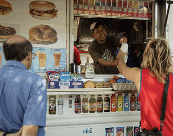
This led us to design based off of a guiding question:
"I like that Pete’s is convenient and quick, rather than cooking or a sit-down." ✅
Ava, Student
⏱️
Rush hour bottlenecks
Lines form fast around noon as students pass between classes and workers order on short breaks. Wait times run 1–6 minutes, but even that is enough to create a backup at a single window.
📱
Most orders already decided upon
Most customers aren't browsing — they arrive with their order memorized or already pulled up on their phone. A menu-first app would slow people down, not speed them up.
💳
In-person only payments
The truck runs almost entirely on a taped-up Venmo QR code and cash. Any digital solution had to enhance that familiar, low-friction system instead of replacing it with something more complicated.
"How might we help customers order and pick up their food quickly and predictably, without losing the personal, community feel that makes Pete's, Pete's?"
INITIAL RESEARCH
The opportunity wasn't adding features - it was matching the pace people already move at.
The challenge for our team was to design an ordering experience that minimized wait times, reduced congestion at the truck, and gave customers more flexibility in how and when they pick up their food, without disrupting the friendly, casual culture the truck is known for. Additionally, because the current business relies heavily on in-person interactions and simple payment methods, we needed to introduce digital features that enhanced, rather than complicated, the existing workflow. This meant balancing convenience with familiarity.
Fly-on-the-Wall Observation Study
To understand Pete's before designing, I conducted an individual fly-on-the-wall observation during the lunch rush, tracking how customers approached the truck, decided what to order, waited, paid, and left. My team then combined our individual observations into a single set of findings:
☕️ Most customers were regulars who ordered without checking the menu
📱 Payment was overwhelmingly digital (Venmo, with some cash)
🎧 The wait itself was filled with phone-scrolling, music, and small talk
Project & Business Model Canvas
From there, I helped build out our Project Canvas and Business Model Canvas in FigJam - mapping the team's goals, target users, risks, and milestones alongside Pete's key partners, resources, value props, and revenue streams. This gave us a shared foundation before any research synthesis began: our primary users were college students 18–24 looking for a quick, satisfying meal, with professors and local workers as secondary and tertiary segments.
Project Canvas:
UX RESEARCH
Every method of research pointed to the same truth: speed and familiarity were the product, and our job was to protect both.
Customer Interviews
I wrote and ran a customer interview script and personally interviewed 6 Pete's customers - students, a professor, and regulars - covering their ordering habits, technology use, and pain points. Patterns emerged quickly: people came to Pete's for speed and personal touches (an employee offering to pour a drink into a customer's own bottle stuck with more than one interviewee), and the most-requested improvement across the board was more payment flexibility, especially Apple Pay.
"I wish there were other forms of payment." ❌
Helen, Student
"The staff is very friendly." ✅
Christine, Professor
Competitive Analysis
My team and I researched four competitors - Wawa, Starbucks, Schmear It, and Spread - auditing their offerings, strengths, weaknesses, and online ordering flows screen by screen. This surfaced feature gaps worth stealing (visible loyalty progress, guest checkout, transparent per-item pricing) and pitfalls to avoid (Starbucks' cluttered featured-item menu, Schmear It's confusing branded terminology).
Visual Audit (Aesthetic):
Low Fidelity Prototype
After iterating on the flow, I ran two more rounds of remote testing. The first (7/10) surfaced confusion around scheduling orders ahead and a search bar that only searched within one menu category. The second round, after reworking the homepage and information architecture, jumped to 10/10 and 8.5/10 - testers specifically called out the rewards page and the "lunch box" cart icon as standout moments, while flagging a bland account page and a missing central homepage.
Functional Audit (Interaction):
Prioritization
My team and I researched four competitors - Wawa, Starbucks, Schmear It, and Spread - auditing their offerings, strengths, weaknesses, and online ordering flows screen by screen. This surfaced feature gaps worth stealing (visible loyalty progress, guest checkout, transparent per-item pricing) and pitfalls to avoid (Starbucks' cluttered featured-item menu, Schmear It's confusing branded terminology).
DESIGN PROCESS & USABILITY TESTING
Personas & Journey Maps
From the interviews and observation data, I helped define four personas. A Convenient User (Kayla, a busy undergrad who orders ahead to avoid waiting), a Social User (Eric, who treats food as part of his social routine), a Budget User (Ryan, thoughtful about spending but willing to splurge on something simple), and a Routine User (Mike, a professor who wants lunch to require zero planning).
UX RESEARCH
I then mapped each persona's end-to-end journey - goals, actions, thoughts, pain points, emotions, and opportunities - which directly shaped our early task flows, especially around reducing decision fatigue and building trust in digital payment.
Branding Direction
Before sketching screens, I contributed to an initial moodboard exploring Pete's visual identity - a warm, vintage Americana palette (navy, cream, coral-red), Quicksand as a friendly rounded typeface, and hand-drawn touches that echoed the truck's real signage.
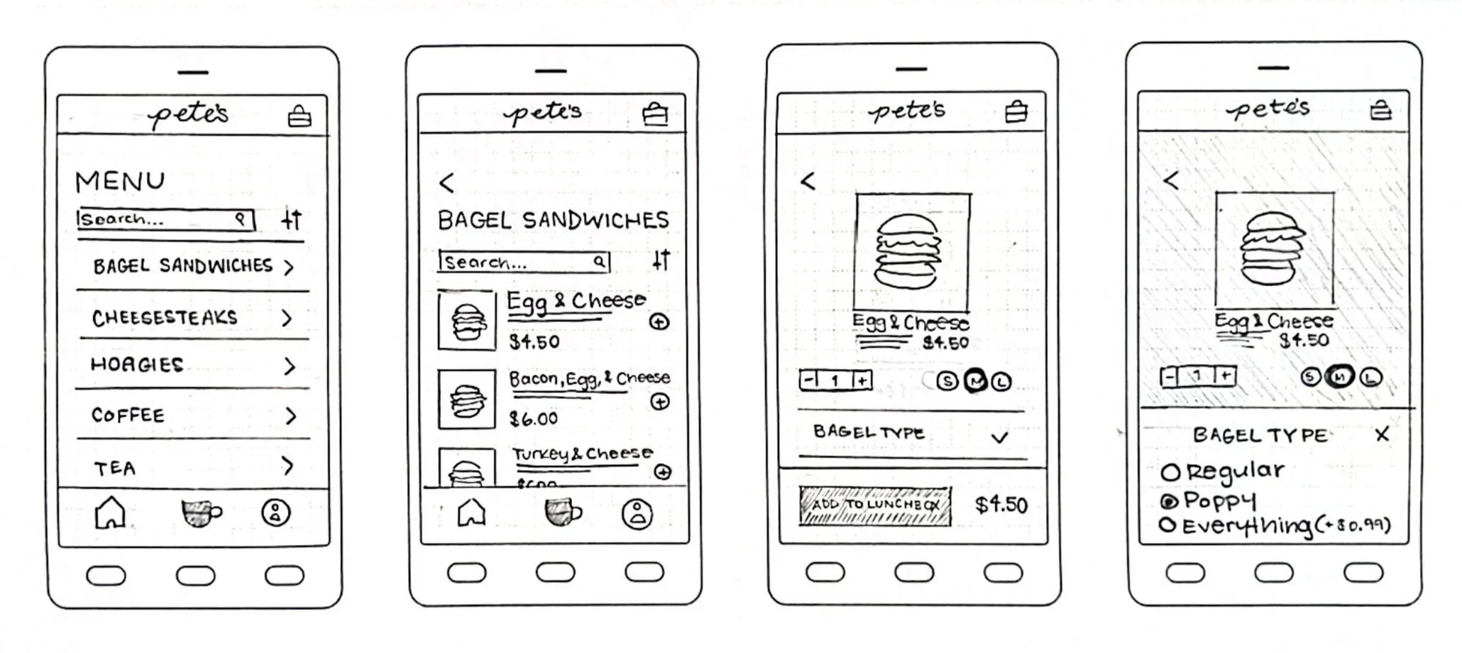
Paper Prototype
I ran an in-person usability test with a paper prototype, asking a participant to sign up, browse, order, and check out. The result was a 3/10 likelihood-to-use score - she found the flow too long, was confused by an early payment-info request, and wanted Apple Pay and guest checkout.
Mid Fidelity Prototype
With color and clearer visual hierarchy introduced, scores were 6/10 and 10/10. The lower score came from a tester who wanted customer ratings on menu items and dark mode - a clear signal that first-time users needed more confidence cues before ordering something unfamiliar.
Testing insight directly drove several key changes to the final design.
💳 Added Apple Pay alongside Venmo and cash, addressing the single most-repeated request across every round of testing.
🎯 Built a true homepage that centralizes truck info, the menu, and rewards - fixing the "where do I even start" confusion that showed up from paper prototype through mid-fidelity.
🌟 Made the rewards section a permanent, prominent fixture rather than a secondary screen, since it consistently stood out to testers as the feature that felt most "Pete's."
🍴 Added persistent filter states and active-filter indicators, so users could tell at a glance which dietary filters were applied.
💰 Introduced pricing transparency for add-ons and toppings during customization, so nothing was a surprise at checkout.
📍 Clarified the truck-location icon with a label and made the address tappable to open directly in Maps.
🧾 Added a live order-status banner on the homepage showing pickup time and prep progress.
From a 3/10 first draft to a design people were consistently ready to use.
By the final round of high-fidelity testing, likelihood-to-use scores had climbed from a 3/10 on our very first paper prototype to a consistent 8-10/10 - a direct result of nearly 20 cumulative usability tests across four fidelity stages. The final prototype supported realistic end-to-end task flows: signing up, browsing and filtering a menu, customizing a food item, checking out with flexible payment, scheduling pickup, and tracking loyalty points - all while preserving the fast, friendly, community-driven feel that makes people choose Pete's over a chain competitor in the first place.
Here's a video of our high-fidelity prototype with the final touches!
High Fidelity Prototype
Final rounds of testing scored 8/10 and 8-9/10. Remaining requests centered on a global search bar, saved/one-tap reordering, and clearer discoverability of truck location and hours.

2025
123 Demo Street New York, NY 12345
Smart Warehouse Retrofit →
“Their strategic framework aligned our disparate processes and produced measurable gains within one quarter.”
-- Recent ClientInitiate a Productive Dialogue
Complete the form with contextual information regarding your challenges, timelines, and desired outcomes, and our team will respond promptly with an evidence-based recommendation framework.